Logo for the Center for Teaching, Research & Learning at American University
Logo Design
Logo Design
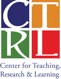
The colors had to be the AU blue and red, plus two of the Ann Ferren Conference logo colors, as this is one of the biggest events organized by CTRL and anybody familiar with AU can recognize it.
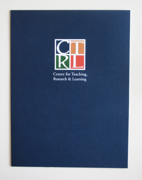
Also, the new logo had to somehow tie into the AU logo, so that they would look good when used together on marketing materials.
Of the Ann Ferren Conference logo colors, I chose orange and green so they would form a tetradic color scheme with the red and blue. I chose a serif font with some quirk to it so it would still harmonize with Garamond (the typeface in the AU logo) but also have its own character and a more playful personality. I cropped the letters within the squares to make them more visually interesting and I didn't center them to create some tension.
Below the mark is the whole name spelled out (some people may not know what CTRL stands for). This is set in Adobe Garamond Pro, per university guidelines.
Overall, I think the two logos work well together, as shown on the pocket folder cover below. The CTRL logo on the front of the folder was embossed.