Communities In Schools Staff Retreat
Logo + Invitation Design
Logo + Invitation Design
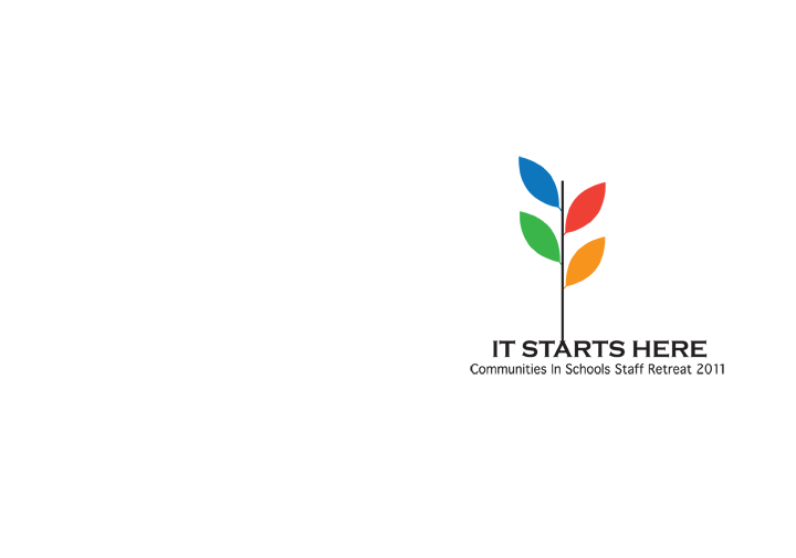
The logo visualizes the concept of regeneration and renewal that would stem from the retreat. The colors of the leaves are the same as the colors of the organization's logo to keep the branding consistent. The logo appeared on numerous e-blasts and collaterals for the retreat. It was also debossed on the cover of recycled paper journals that were given to all attendants.
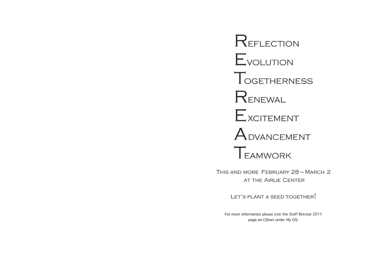
The interior of the invitation features an acrostic spelling out "retreat" made with words that were relevant to the staff retreat's objective.
The interior of the invitation features an acrostic spelling out "retreat" made with words that were relevant to the staff retreat's objective.